


I love music and enjoy the vinyl format the most. Along with my grandfather’s collection of the National Geographic, my parents’ record sleeves were my introduction to photography, where I found a compelling magic in the combination of audio and visual that has never left me.
I think I came up in a golden era, post-Punk into Rave, but then any middle-aged codger who goes on about music will tell you that: the experience is profound if not particular. A strand of this profundity is wonderfully retraced in an upcoming ‘mook’ (a Japanese format where book meets magazine) by Nick Waplington entitled Made Glorious Summer. Published by Powershovel this autumn it is an evocative trip through the early Thatcher years mixing his photographs with ephemera and record sleeves. Although his, it feels very much ours. How sad, then, that it’s coming out in Japan rather than the UK.
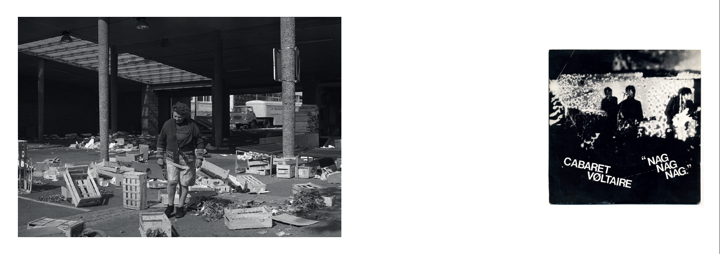
We live through a commercially partitioned era of lost chronology and amnesia. In this, ‘Oi! Keep-up, consumer!’ digital bully-culture it might seem odd to be writing about an apparently anachronistic format, yet new photo books by Chris Coekin and Richard Mosse both included 7” singles as part of their publication. As so much art photography continues to ponder physicality and rake it’s own coals it is relevant to consider all formats, all histories. I think that’s just good cultural manners.
In my formative years a record sleeve and it’s contents would often be the point of departure for a whole set of feelings and desires, suggesting what I wanted to be by prompting what I could be. Like many a coming-out country queer I found solace and affirmation in the manifestations of other gender roles from Bowie to Morrissey. The carefully considered use of photography by these ambiguous men was part of a broadly acknowledged culture, so left me feeling less isolated and gave me clues as to what kind of fabulous being (or not) I might become.
An important, not to mention culturally undervalued, ramification of the subtle messages created by these musicians has to do with the way that they spoke to gays and straights, boys and girls. How clunky and dull does most art photography that seeks to deal with ‘the body’ and ‘identity’ seem when compared to the fantastical inventions of British popular music? Sad but true, I’d rather go to Rough Trade East than The Photographers’ Gallery. The visual culture in the former, arguably ‘just’ a bi-product of the music it compliments, feels more varied and alive and accessible and inventive and freed-up, plus you don’t get those condescending wall texts.
There are two sleeves from my childhood, prior to my own selections starting age eleven, from my parents’ blessedly groovy collection that I remember very clearly. Both sleeves followed a traditional pop format of portraying the artistes in an aesthetic that suggested not just the sound of the music but something of it’s intention.
Open by Brian Auger and Julie Driscoll dates from the swinging London of 1967. The simple formal device of having orange type on purple on one side reversed on the other with monochromatic portraits taught me something about printing and design. Credited to Paragon Publicity there is no reference to a photographer. There is no obvious ‘front’ to the sleeve: Julie features one side and Brian the other. Her portrait is a contemporary, fashion-style image that quietly exemplifies her still, fine features and boyish crop. His, an energetic action shot seen through an abstract whirl. The designer has used the colour fields to marry different types of portrait, which suggest the energies and performances contained in the music.
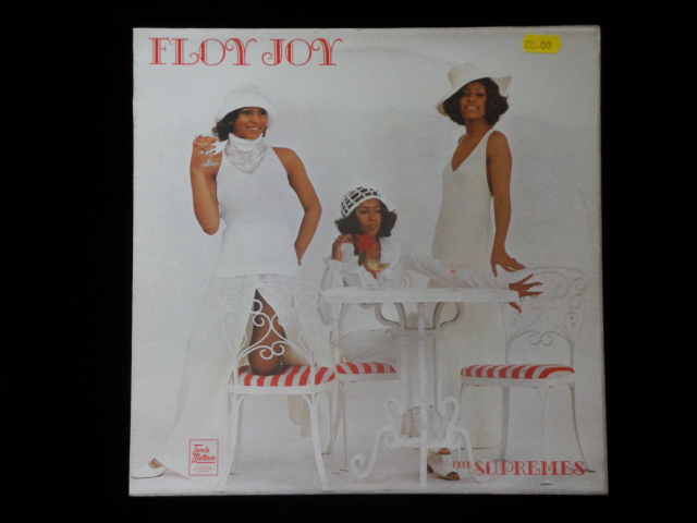
The other sleeve was for The Supremes, 1972 and post Diana Ross. Entitled Floy Joy and produced by Smokey Robinson for Motown the album is still a firm favourite. All the stomp and shuffle that you’d want from a solid soul record, and with subtler psychedelic florishes than Norman Whitfield was serving up at that time. The sleeve was shot in-house and is indicative of Berry Gordy’s marketing strategy of selling culture that bridged racial divides. The Supremes feature poised with martinis, full length in understated white outfits in a white studio set-up with white furniture as props.
Apart from the graphics on the sleeve almost the only colour in the image is their African American skin. (Is skin a colour or an organ that contains a body?) As a ethno-sensitive child I read this as a diffusion of their race and have no doubt that it was an influence when we made ‘Strictly’ and my first approaches to fashion photography, deliberately working with Black British models in the early 90s. (The Supreme’s photograph was taken by Jim Britt who, coincidentally, was also responsible for a 1988 Comme des Garcons’ advert of two girls laughing in dental braces, the ‘imperfect beauty’ of which resonated for an upcoming generation of documentary style fashion photographers).
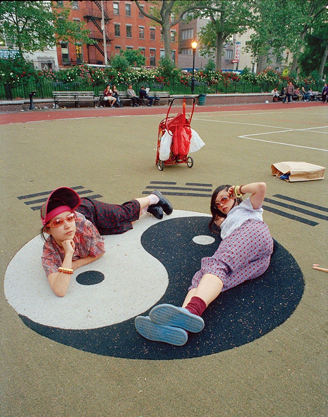
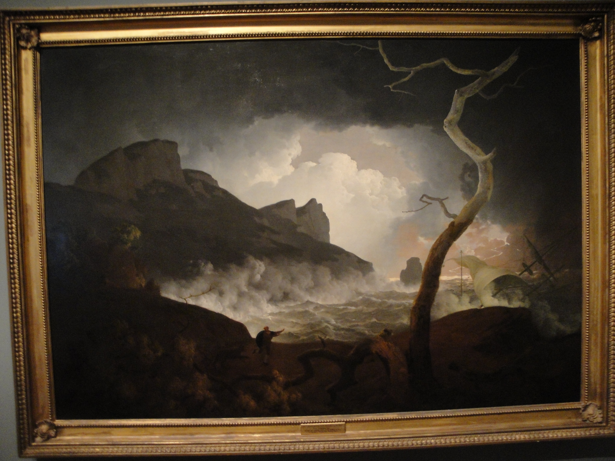
I enjoy the mysterious way an image can look as the music it accompanies sounds, and vice versa. Of course there’s an element of auto-suggestion involved, but I can ‘see’ when I hear and I’m sure you can too. This is manifest in the sleeves that I’ve made, especially for Kieran Hebden, aka Four tet. Similarly, I recently made an action at the AGO in Toronto called Music for Looking. A wheeled trolley was constructed with a deck, an amp and a PA which was pushed around the galleries to a series of paintings chosen for what I felt was their aurally evocative qualities. Such a thrill to make the connection and blast out Michael Garrison’s Eruption next to Joseph Wright of Derby’s Antigonus in the Storm. Far out, man.
The symbiosis of a record sleeve and it’s contents sets up a situation loaded with potential. We all know how images are, to varying degrees, dependent on contextualisation for specific ‘reading’, and that context is often text driven. When that text is a lyric and the lyric becomes song and the song becomes music the resulting cultural experience can be very potent. The specific ambiguity of this format can engender what so many of us feel as a deeply personal experience, despite being shared. This kind of culture fascinates me and I often wonder how or why it has become so maligned.
An inherent snobbery in our cultural institutions has often overlooked vernacular histories… let’s hope Bowie at the V&A and Jeremy Deller’s recent Venice appointment can be seen as a sea change. This once ‘great’ nation (only 22 countries we haven’t invaded) groans onwards towards what exactly? One of the UK’s last (truly inspiring) assets is it’s peoples and their cultures. The criminally under-supported impact of British creativity on the rest of the world is often mediated by applied photography, the photography that is usually seen at the bottom of the imagined hierarchy of lens-based image making. Why malign any form of culture when the process of embracing it all, joining the dots and finding your own versions of events is still an option?
Published on 4 August 2013
Commissioned by Photoworks