We hope you like our new look. We have been working behind the scenes with our designers Cause & Effect, and critical friends, partners and artists to reassess our visual identity as we mark our 25th anniversary.
Kerr Vernon, Founder and Director of Cause & Effect, shares the ideas behind our new look and feel:
For the past six months, we’ve collaborated closely with the Photoworks team on a complete overhaul of their brand identity. The new brand aims to position the organisation as making photography meaningful and accessible to everyone.
Back in October 2019, we kicked things off with a workshop at their Brighton HQ, where we helped define their mission, vision, values and tone of voice. These outcomes then informed a variety of different possible branding concepts before settling on the finished route – a bold, flexible and robust identity system that’s built to last.
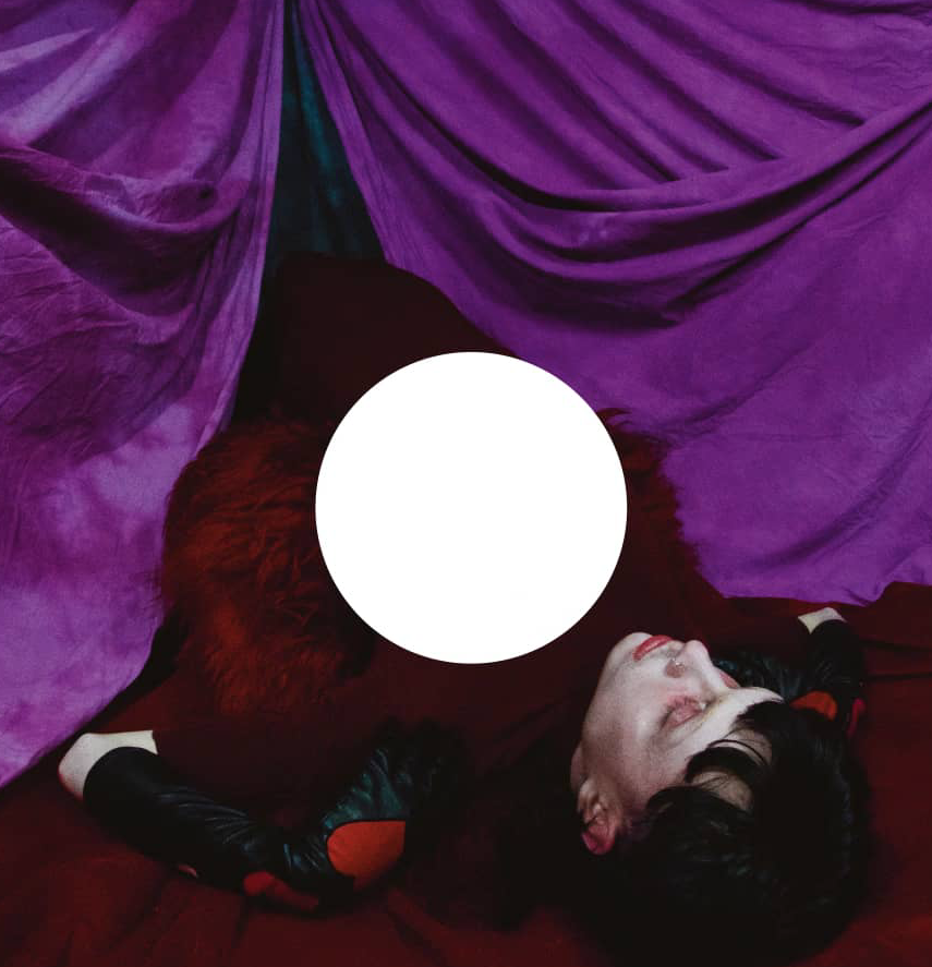
Taking inspiration from a range of photographic influences, we created a custom logotype based on the font Proto Grotesk Bold. The circle that forms part of the lower case ‘r’ is a subtle visual nod to a lens or camera shutter button. This idea really thrives when animated. The primary colour palette is deliberately neutral, allowing photography and digital content to take centre stage. This is paired with a more colourful secondary palette inspired by a mix of photographic processes, such as cyanotype, and key colours from major photography brands, including Kodak and Fuji.
The new Photoworks brand is imbued with subtle links to photography. It’s been a really rewarding creative journey seeing things coalesce into the finished identity.

