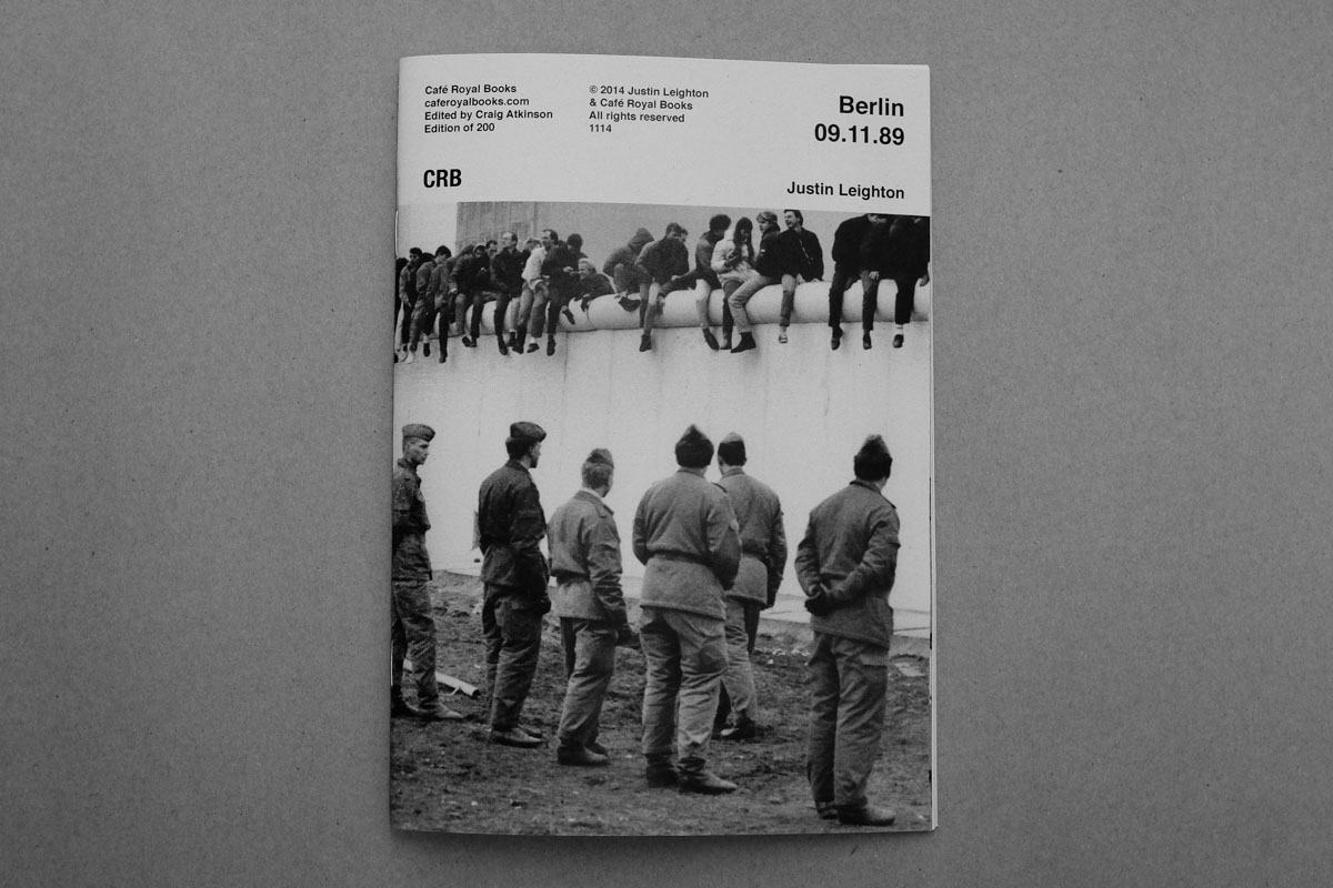
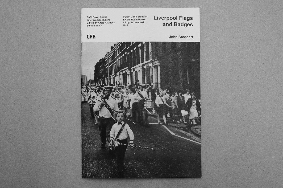
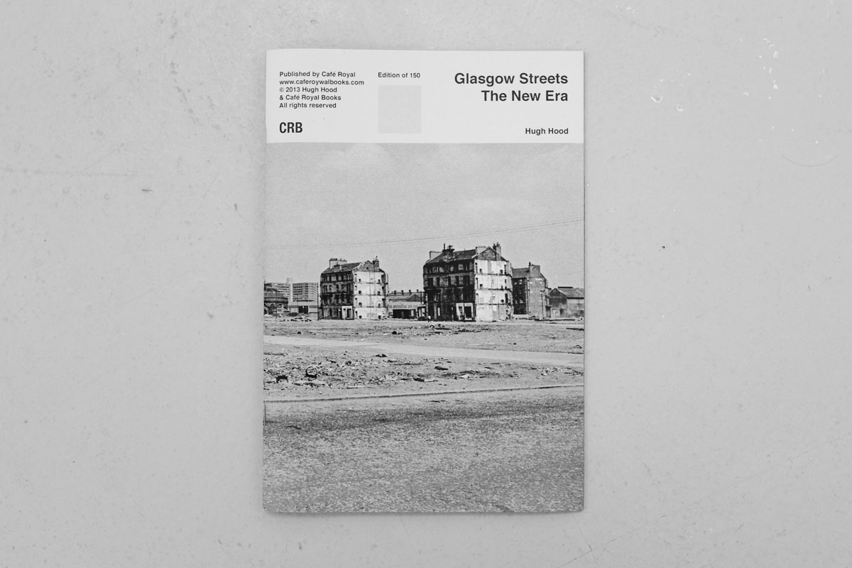
Craig Atkinson talks to Alice Compton about the titles published by Café Royal Books, the weekly photobook publisher.
How and when did you start Café Royal Books?
I started Café Royal in 2005. I come from a Fine Art background, educationally speaking. I used to make large, time consuming, expensive, heavy abstract paintings. I only ever exhibited each twice – I didn’t like showing them any more than that, preferring to ‘move on’. Because they took so long to make, around 18 months, I felt I had to store and look after them. Their weight was a problem and meant that realistically they could only be exhibited in the UK. In every possible way my process was unintentionally limiting in terms of who could see my work. I decided to ‘quit’ painting and return to drawing.
Over the next year I produced a lot of very quick, simple drawings and wanted to exhibit them, but in a way that didn’t rely on galleries as my painting did. Books and zines seemed right; affordable to produce, quick, easy and cheap to post anywhere in the world. The idea of ‘the multiple’ was appealing too having spent the previous ten years concentrating on single paintings. Down the line a little, I began collaborating with artists, inviting them to submit work that was meant for a non-gallery space. That was around 2006.
You publish a book a week, can you describe your process from concept to print?
I publish a book every Thursday. Simply, the process is either me researching, finding work and photographers to collaborate with or them proposing ideas to me. Many of the photographers I work with have vast archives, in various states of order! We discuss ideas and in many cases arrange a series of three books to be released over 18 months. I design all and edit most publications. Each book is slightly different; some photographers have a very exact running order, title, layout and tight edit. Others will send me 100 images for a 36 page book, leaving everything to me. Both methods work well and the change is refreshing. I do enjoy having to edit down from a larger selection – it’s a real pleasure. It’s a bit like a puzzle, slotting things into place to make sense of it all.

Who prints café Royal publications?
I use a local family run firm. I’ve used them for years, they understand what I want and they’re sympathetic to my fussiness. I visit them 3-4 times each week for proofs, finals, edits. It’s vital to have a good relationship with the printer, and to use a printer you can visit at short notice and discuss, face to face, the books being made.
Your books have a distinct aesthetic. Do you have a strict editorial policy?
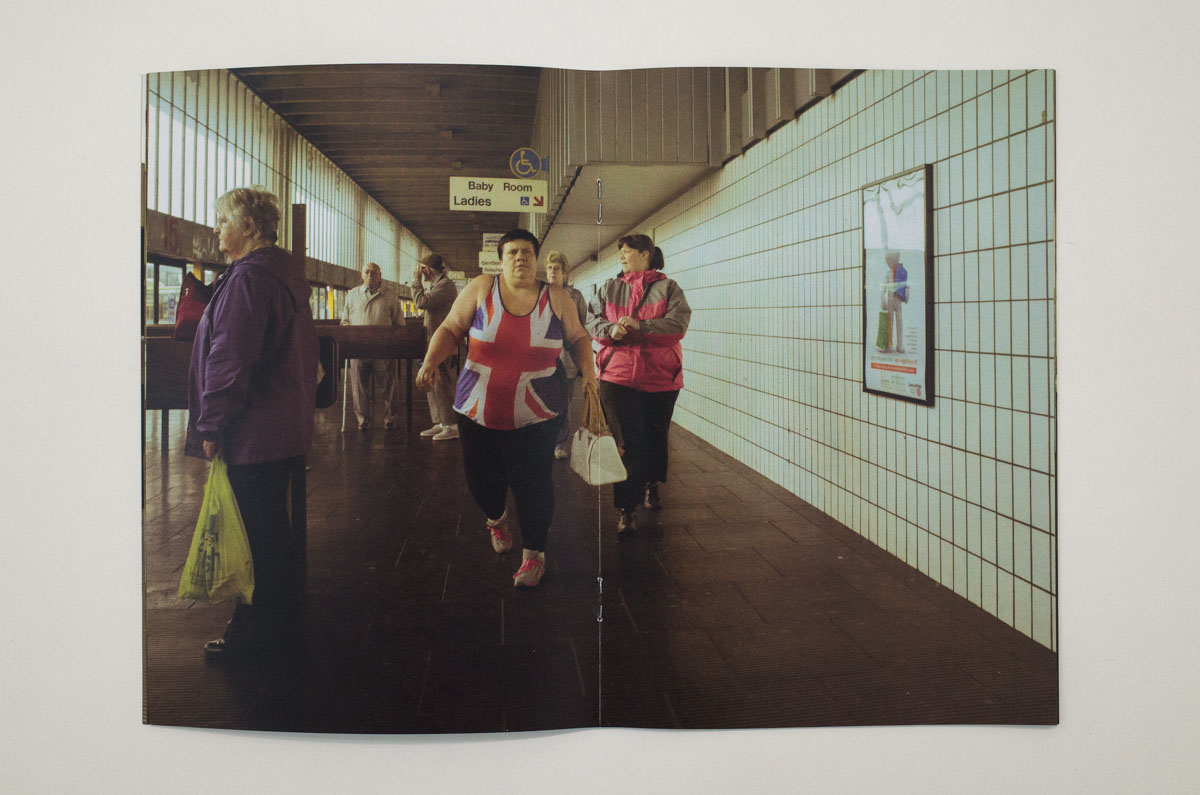
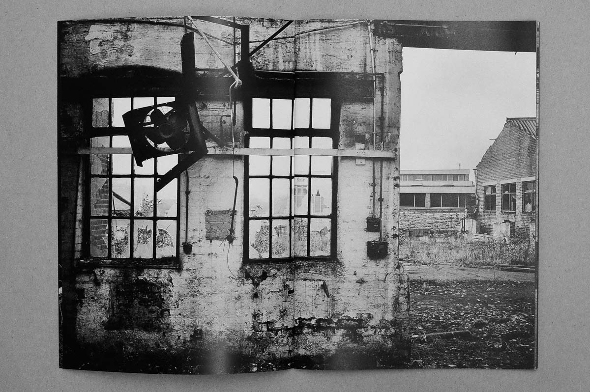
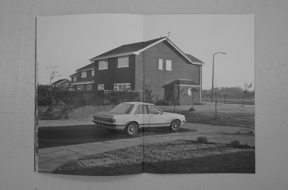
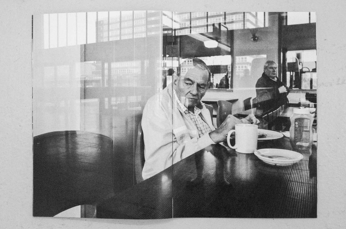
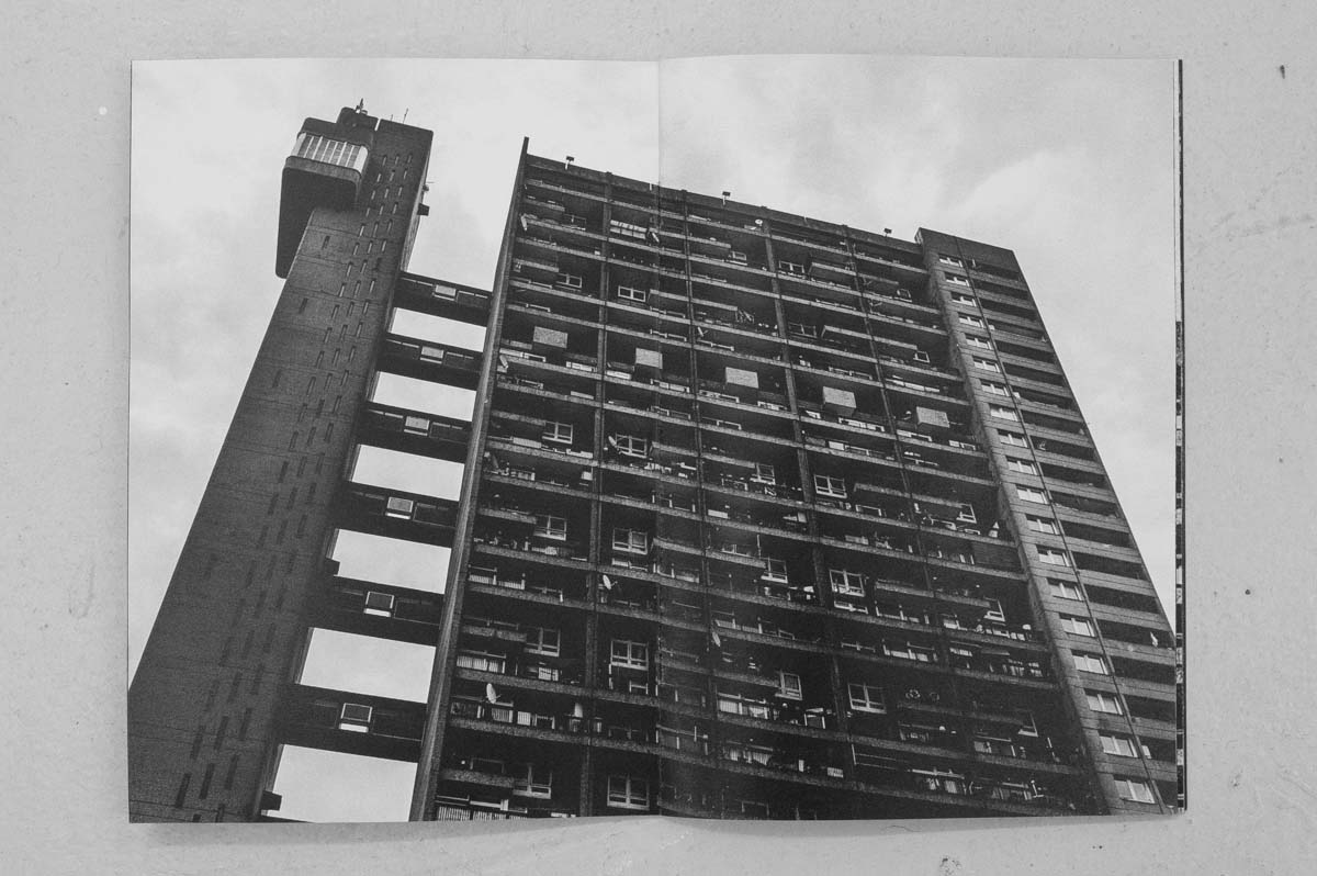
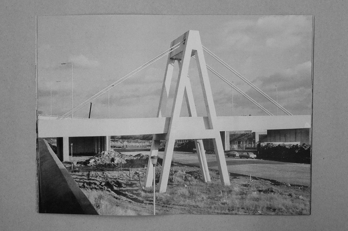
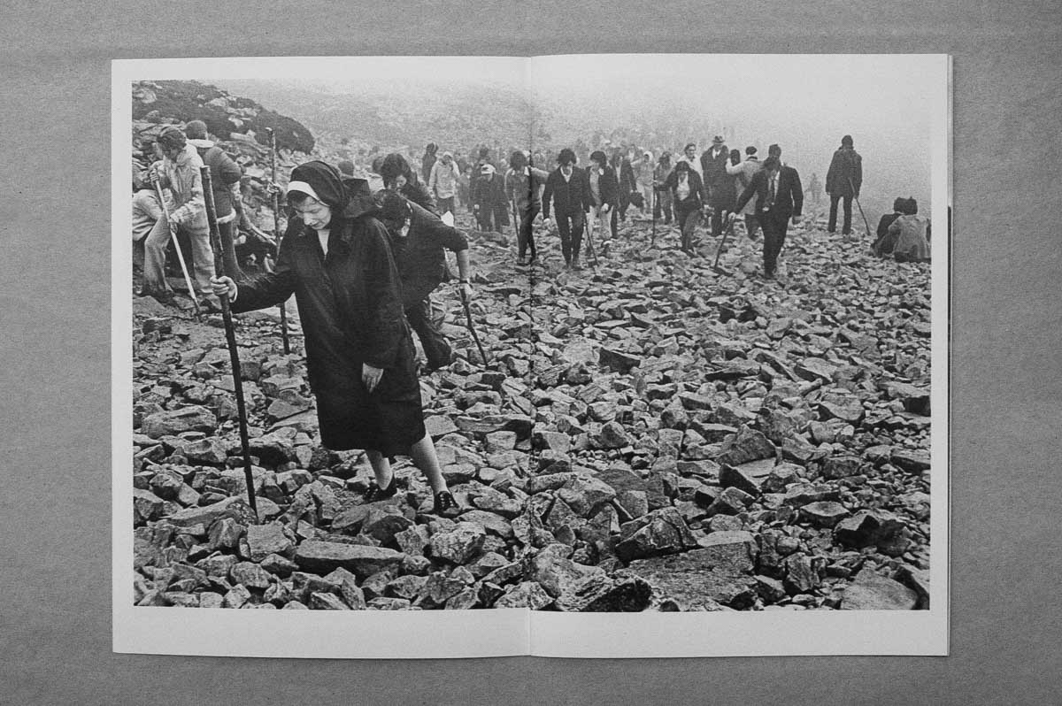
I don’t have a fixed editorial policy. I think to do so would be too restrictive, at least in terms of this type of book. I prefer to publish work that hasn’t been seen much, and not in the same context if it has been shown before. I will only publish work that I like. I publish books that I’d like to collect. I publish work in the same or similar format because I see it as an ongoing project and the books as a series. Work can be from archives but doesn’t need to be. I like to publish work that documents an aspect of change, generally but not exclusively in the UK. The photographers I work with don’t have to be well known. At this stage I have always worked directly with the photographer, except on one occasion. I think that is important; the conversation and to get more of an understanding of why the work exists.

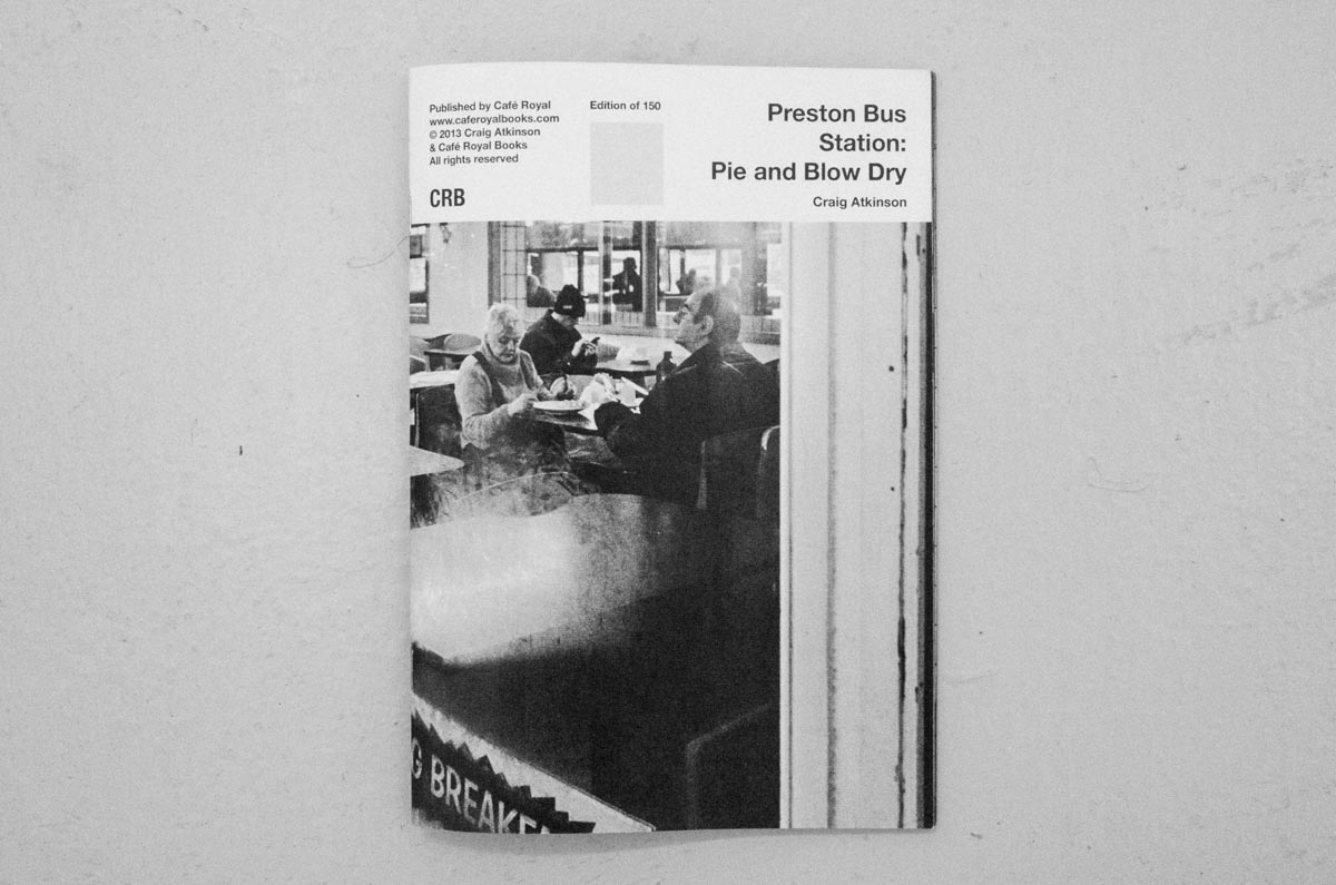
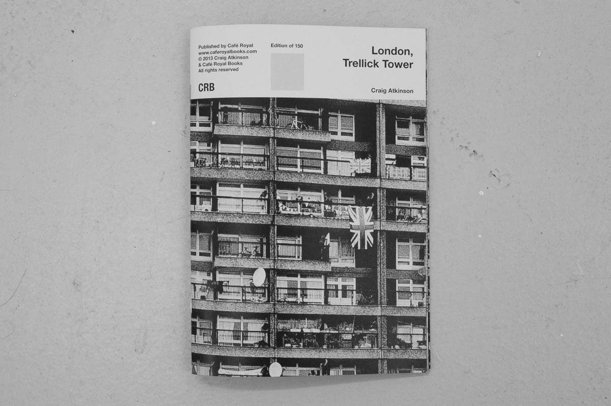
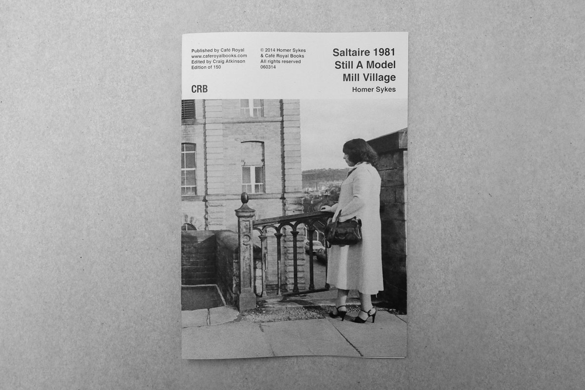
I like to keep things simple. The books should be affordable to make and to buy, and straight forward in terms of what they are. I made the decision a couple of years ago to put the colophon on the cover, so instantly you know who it’s by and what it is, the date and edition size. It has also, accidentally, created quite a strong identity which I think people like. They look like quite a coherent series on a shop shelf for example.
And I never say no to text. I let the photographer suggest text – I’d never request it. Sometimes text is submitted that basically describes the images, which I think is unnecessary. John has text in his first two or three books with me, then none in the fourth and fifth. If the text describes something that can’t be got from the pictures, or that discusses a wider project or context that makes more sense.
There is work submitted that I’d love to publish but that falls outside of the overall theme of ‘change’. As much as I dislike restriction in that sense, I think it’s important for me to remain focused because there’s only so much I can do.
Can you talk about one or two of your publications that required or were complemented by text?
My main concern is photographs and perhaps narrative. I think my abstract painting past still plays a part in terms of my relationship with descriptive text. I would never title paintings because I wanted the painting to be read with no input, no bias, no signs or signifiers. I think the same, generally, about inclusion of text in the books. Most of what I publish is quite straight forward and doesn’t require text. Tony Bock, for example, likes text as a reference point, so we print the location of each photograph. John Darwell’s project was significant to him on a personal level in many ways, as well as being some his last mono work before turning exclusively to colour. The reader doesn’t necessarily need to know this but I don’t think that kind of information affects ones reading of the images; it doesn’t really provide extra information, just surrounding information. Jim Mortram’s project in some respects falls outside of the ‘usual’ Café Royal subject matter, but I like his project and we gave a lot to charity. On a simple level I love the images; the blacks and the darkness. His books have included text, and that seemed right because the project could, and sometimes is taken the wrong way. It’s a difficult long-form project and does require some contextual information.

Is there a body of work you’d really like to publish?
Yes and no. I don’t chase projects as such. I love finding things out, researching, making connections. So the work I’d like to publish, I think, is that which I don’t yet know – a cliché perhaps! Although there are a couple of things I’d like to publish actually by John Myers and Chris Killip, so I do have a list.
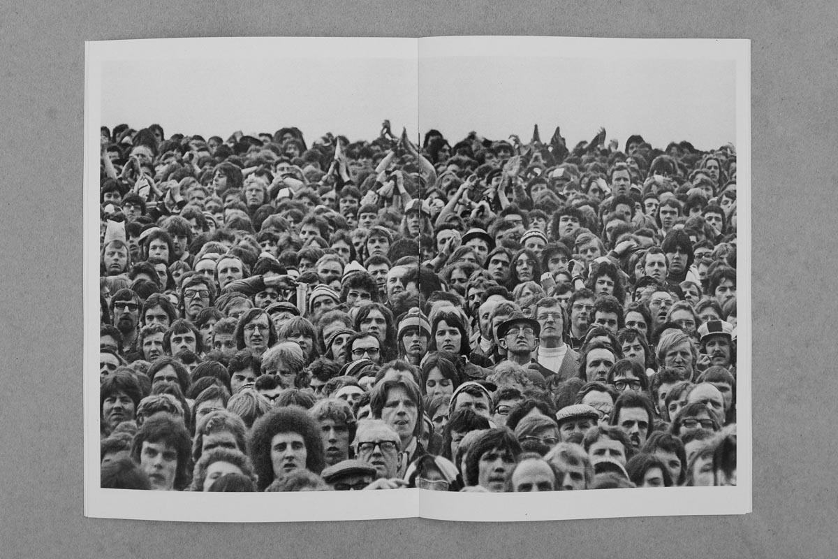
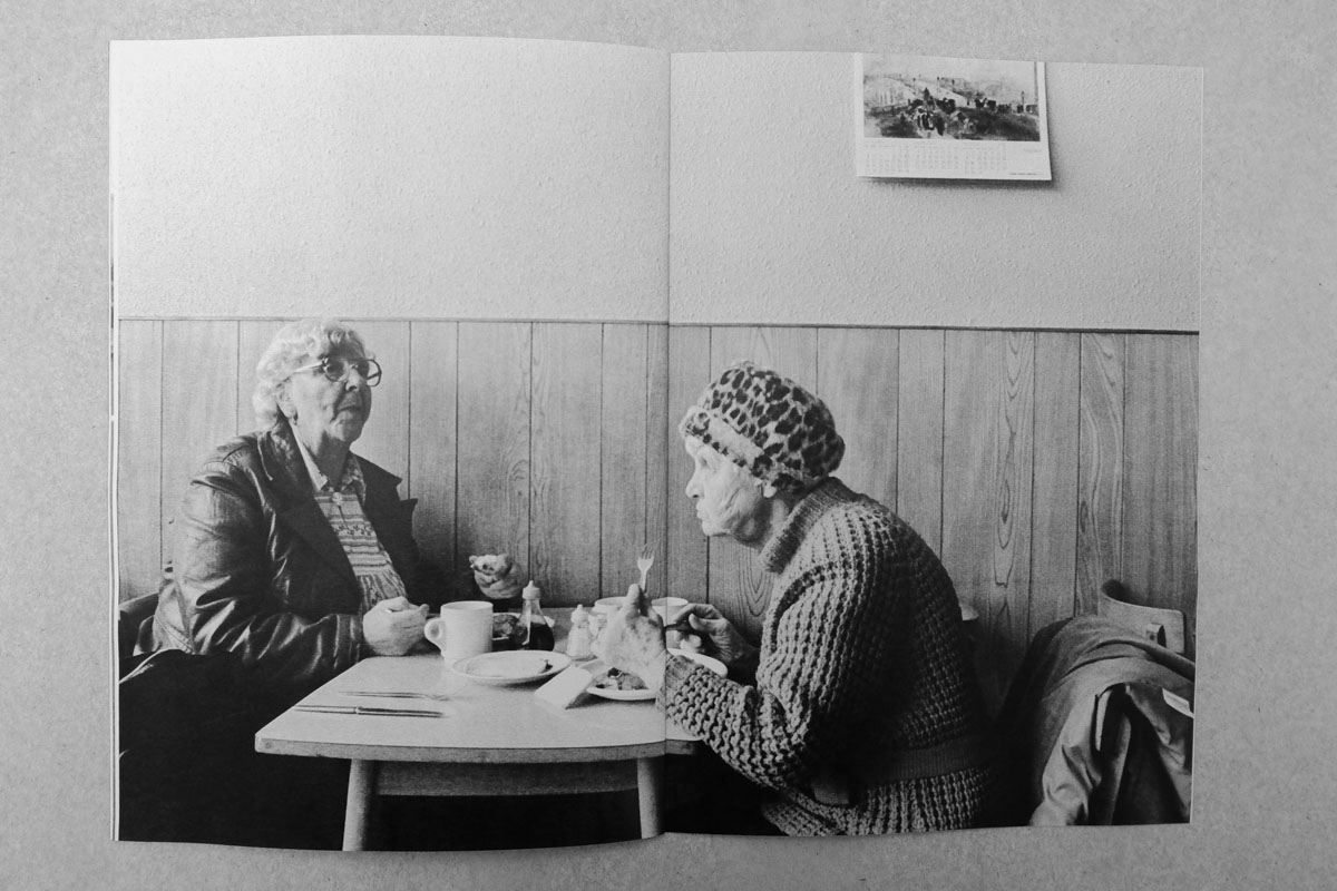
Something that kind of gives me a kick is giving photographers a reason to revisit their archives. Homer Sykes for example works almost entirely from his archive now, it is one of the better presented and more organised ones. Most photographers have an archive of some kind, even if it’s a suitcase full of negs under the bed. Offering a publication (albeit a very small one and limited run) gives opportunity and reason to look back, sometimes the look back affects their current work too. I get a lot of feedback from the people I collaborate with and the recurring thing is the pleasure in being able to look back through past work, and often ‘leaving it to someone else’ to edit.
A secondary aspect is that the UK still falls behind in terms of gallery photographic collections. We’re not like America. So, as small as these books are, galleries collect them and so they are putting small bits of information into the gallery collections, libraries and archives. I realise they’re not photographic gallery prints, but it’s still getting the work in and re-archived in a publicly accessible institution. This has become an aim of mine really because I want people to see the work but that is contradicted by the small edition sizes. So the work then being placed in a public space means anyone can access them.

Whose work, of the photographers you’ve published, do you think deserves more recognition?
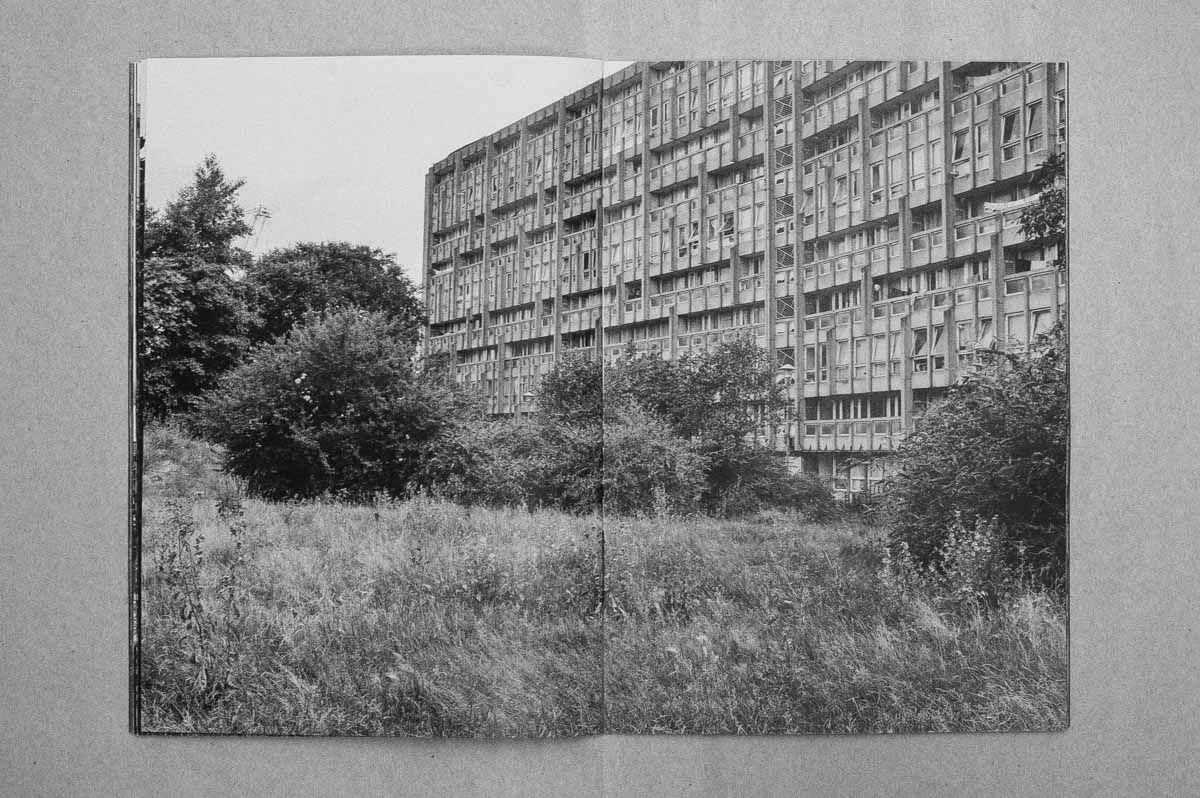
That’s really difficult. I could put arguments forward for each individually. Patrick Ward (forthcoming), Tony Bock, Stephen McCoy, Geoff Howard, George Plemper…I think each is recognised but perhaps not as widely as they should be. I’m working with Patrick Ward on a couple of books that use the Manplan photographs from Architectural Review in 1969-1970. Patrick’s work was in the first issue. The Manplan series was so daring at the time, kind of outrageous but so important. Patrick is well respected but I think that body of work, and the editorial courage of that series really needs looking at again.
A lot from the past, things that have just gone with no record. Recently I’ve been talking to Justin Leighton about Network Photographers. Such an important time of which there is no trace.
In your opinion, what makes a great photo book?
At risk of contradicting some of what I’ve already said, I believe each book should be determined by its content. Some use ‘the book’ as an object, and the function of the book fits the content. Hidden Islam by Nicolo DeGiorgis, for example. Gate fold sheets that open to show the inside of what is printed on the outside. A simple method but the content and the form working well together.
Then there’s books like Eamaon Doyle’s i, which is beautifully produced. The print quality is amazing, the binding and cover is just luxury. It’s a great book and over-the-top production wise but really works well. Broomberg & Chanarin’s Holy Bible is produced completely in context and wouldn’t work any other way. I was lucky to take part in Moriyama’s print show at Tate. Menu, the book made on the day is as much a record of the day as it is a Moriyama book. It’s a bit clumsy but the surrounding factors and personal experience make it a strong book.
Moriyama’s new Super Labo published Marrakech book in a slip case is great, a double book with infinite narratives.
Other than books which use a unique form; so standard type coffee table books, for example, I think if the book is coherent, and tells you something, and the photographs are good then it’s hard not to engage with it. Books like Ken Grant’s Flock, Peter Mitchell’s Strangely Familiar, Tom Wood’s Men and Women are all standard format (except perhaps the cover and end paper of Flock), but they document a specific thing, clearly, and the images are really great. You can’t ask for more than that I don’t think.
